
In addition to our major iOS mobile update today, I’d like to make another announcement: As of today, Ben Pryhoda is now the Chief Product Officer for TrainingPeaks. Ben has been behind the scenes as both Director of Engineering and VP of Engineering for several years. He’s the driving force behind our mobile efforts and will further oversee all product engineering going forward. You could say the torch has been passed. While I will forever be involved in the TrainingPeaks roadmap, Ben is really the one driving our products forward and coordinating all of our engineering teams. As you can see from the incredible progress we’ve made in mobile, the future development of our entire ecosystem is in good hands and I couldn’t be more happy for him, or for all of our loyal customers who will benefit from his dedication and passion.
– Gear Fisher
With this update to our iOS app we are delivering Premium features that you, our users, have been asking for. One of the most requested features of our mobile apps has been the Performance Management Chart. Not only have we brought the PMC to our iOS app, we have done it in a way that you may not have been expecting and I am very excited to share it with you. Moving forward you can expect additional updates and features based on your feedback, so please keep it coming. Before you ask, yes our mobile team is hard at work bringing these same new features to the Android platform as well. Now let’s dive in.
The new features in this update build upon the analysis features added in our last update, and in doing so make our iOS app a complete tool for planning your training, tracking your workouts, and measuring your progress.
This update includes improvements to the existing Fitness Summary Chart and introduces the all new Training by Day/Week Chart. Between these two charts there are over 100 different pieces of historical training and metric data that you can track.
Fitness Summary Chart
The Fitness Summary Chart now lets you choose from 14 different pieces of data, filter by sport type, and select the date range that is most important to you. Some of the data you can choose to review is: Duration, Distance, TSS, Average IF, and Elevation Gain. If you train in multiple sports, this chart lets you see where you spend your training time, how each sport contributes to your total TSS, and compare training intensities across sports.

Training by Day/Week Chart
The all new Training by Day/Week Chart, which was code named the Über Chart, lets you select from over 100 pieces of your historical training and metric data, filter by sport type, and customize the date range to create a chart that is personalized for the way that you want to analyze your data.
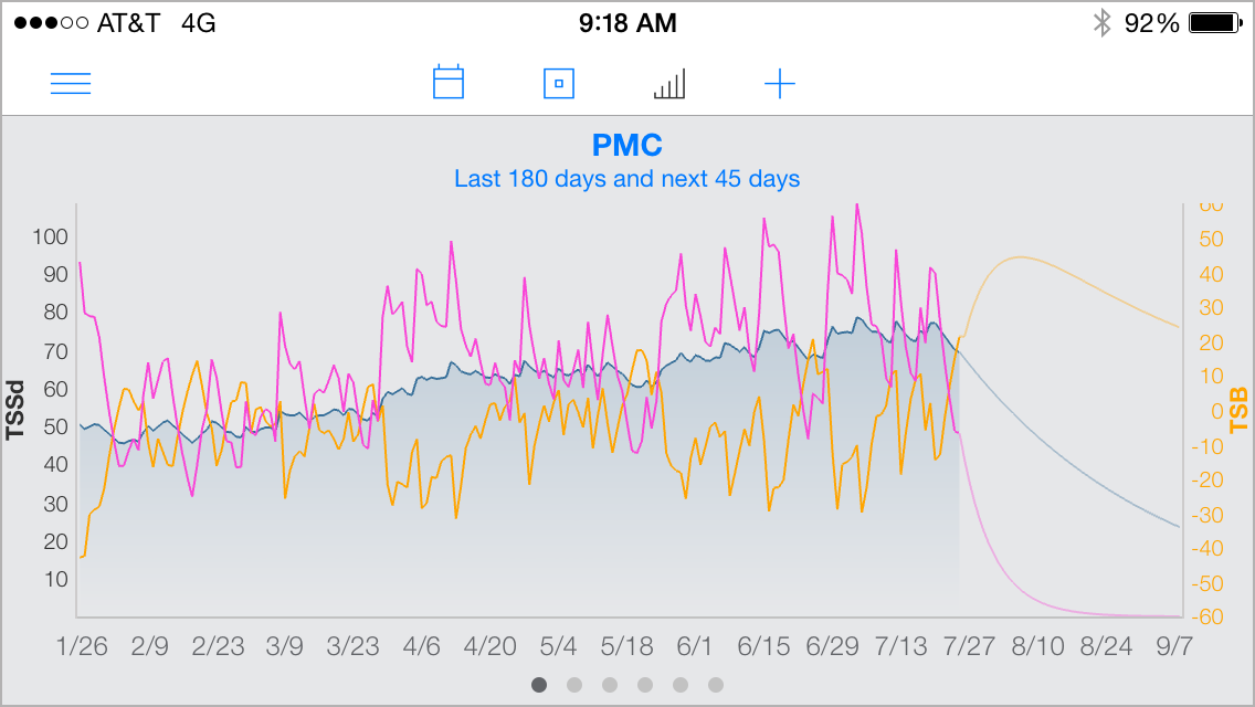
There will be several default charts when you first load the app. The Training by Day/Week chart below shows the three components of the PMC, CTL, ATL, and TSB. Other default charts include Duration, Distance and TSS by day. All charts can be customized and you can have up to 12 charts.
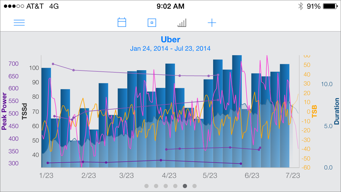
The chart below shows how you can customize a chart to view the data you want to compare. Here, best 30s, 1m, 5m, and 20m peak powers and Duration by Week has been added to the chart above.
To begin customizing your Dashboard tap on any chart title to access the Dashboard’s settings along with each individual chart’s settings. Here you can rearrange and rename your charts, set sport type filters and date ranges for each chart individually, or globally for all charts at once. All Dashboard charts support portrait and landscape orientations on your iPhone and iPad.

You can also configure a Training by Day/Week Chart to show any of the 58 metrics like weight, sleep, motivation, fatigue, hydration, or injury that you may be tracking.
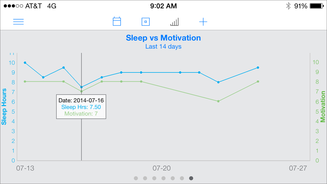
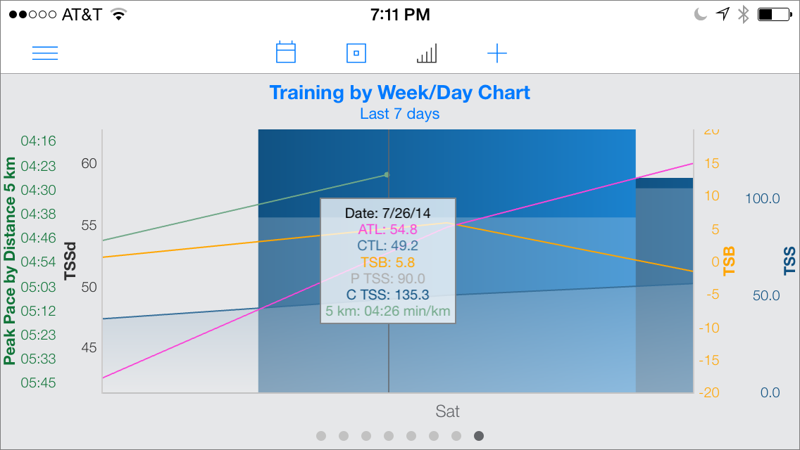
The Training by Day/Week chart also supports zooming and panning. You can tap on the chart to access a tooltip to see exact data values. Tapping the chart scrolls the Activity Feed to that day, and double tapping on the chart resets the zoom.
While these new charts add greater functionality to your mobile device, I believe this is just the start. It is my goal to continue to develop more features and innovations across all TrainingPeaks products. I am looking forward to keeping you updated with new releases and features that help you reach your goals.